Graphic expression
Our graphic system is designed to express clarity, warmth, and intelligence. Each element builds a cohesive visual language that feels modern, human, and distinctively Customer.io. Together, they create a brand that’s as adaptable as the platform itself—grounded in structure, but full of life and expression.
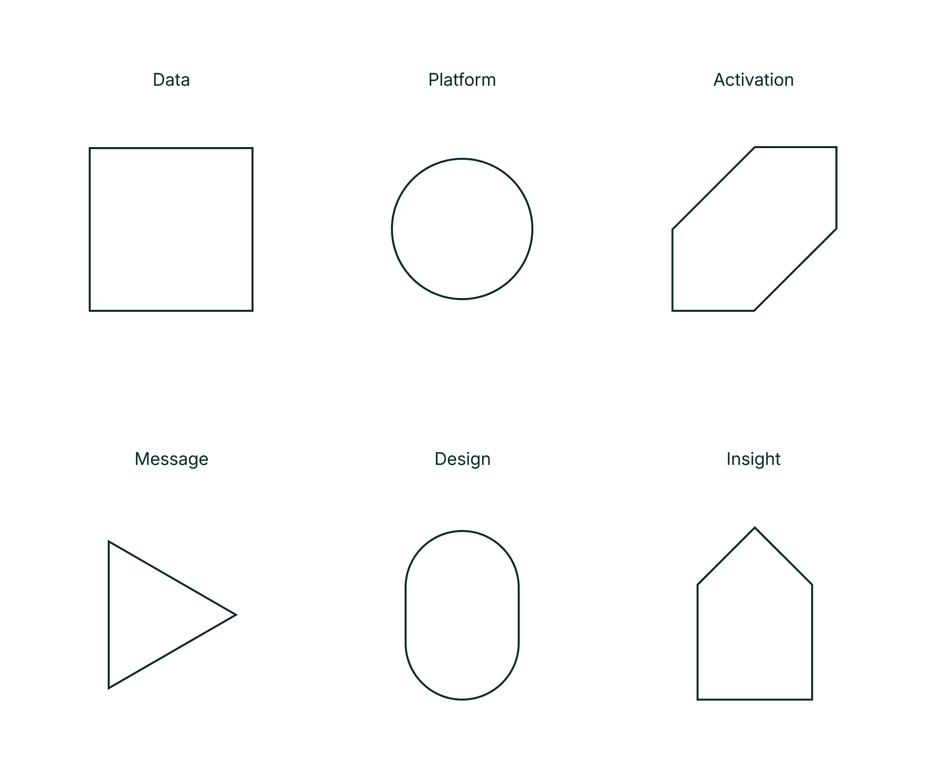
Shape language
Our foundation of geometric forms—simple, structured, and endlessly adaptable. These shapes connect visuals across our system and echo the clarity of our platform.
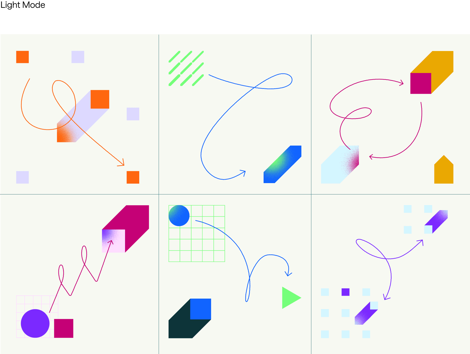
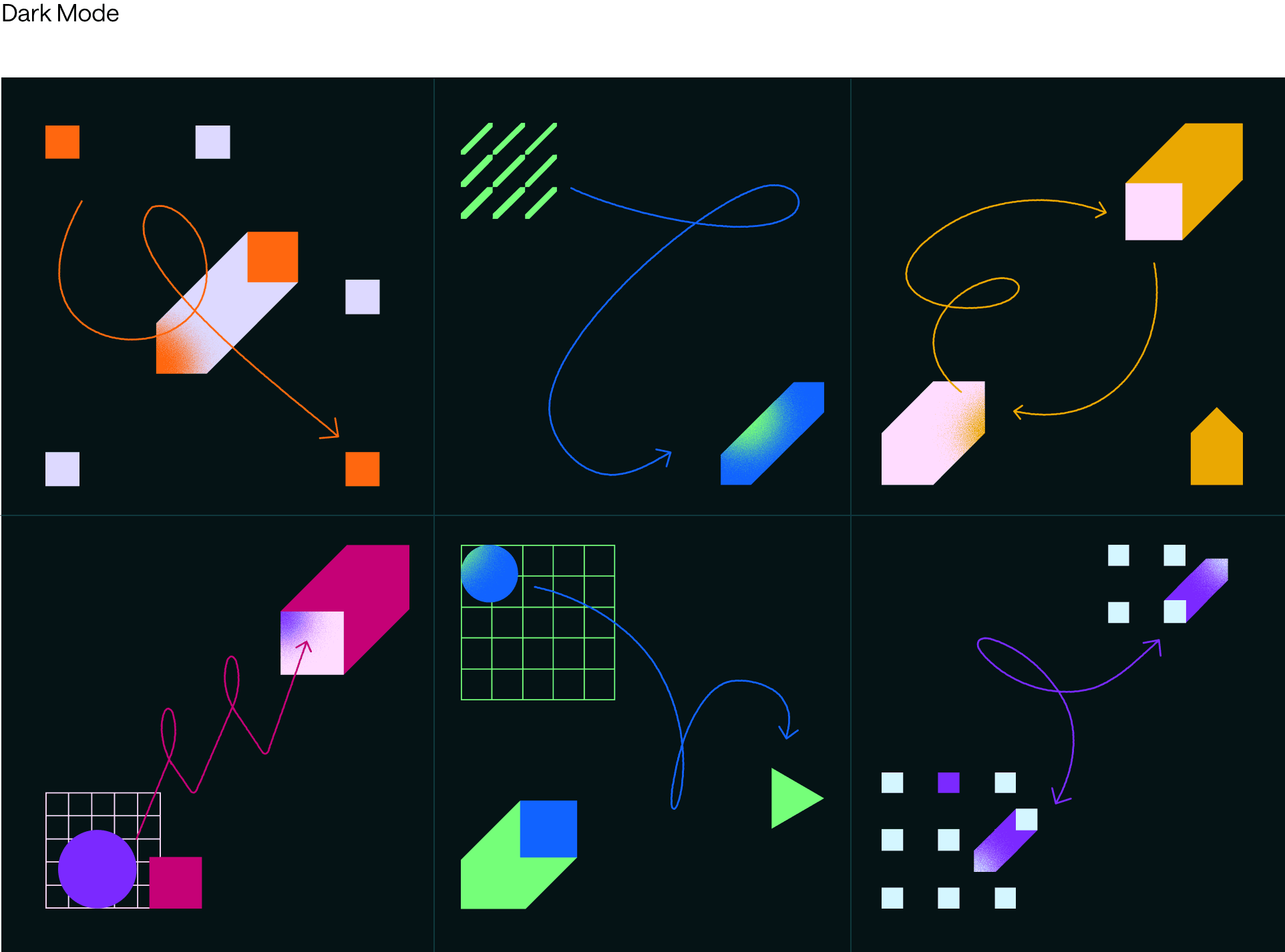
Abstract illustrations
Clean, geometric compositions that visualize ideas and data with clarity. Designed to bring movement and balance without literal storytelling.
Iconographic illustrations
A bridge between icons and scenes—more detailed and expressive but simplified for scalability. Ideal for web modules and product storytelling.

Secondary uses

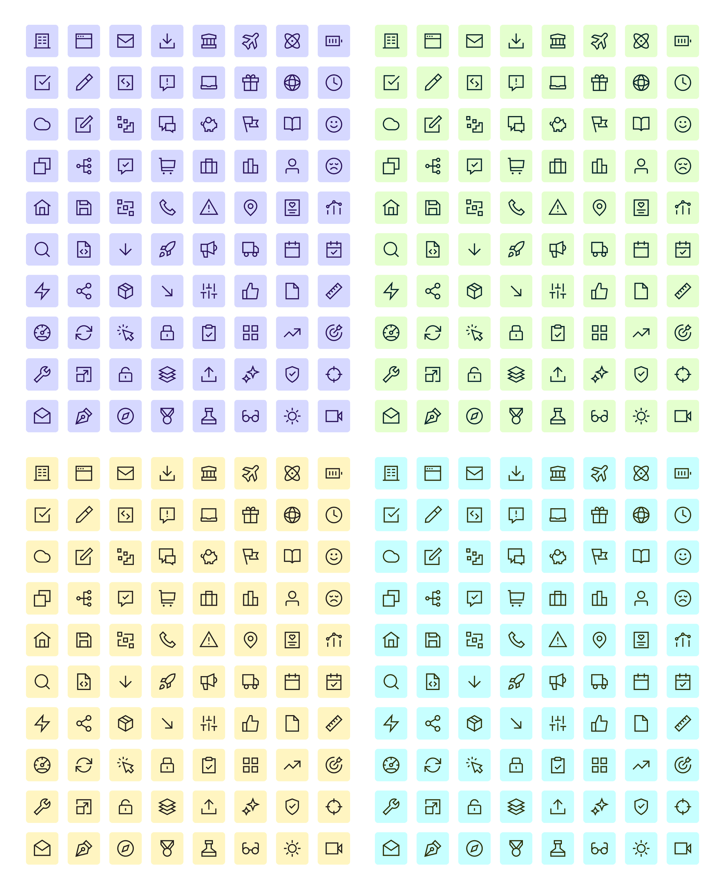
Icons
Our essential symbol library. Minimal, functional, and grid-based to ensure consistency across digital and product environments.
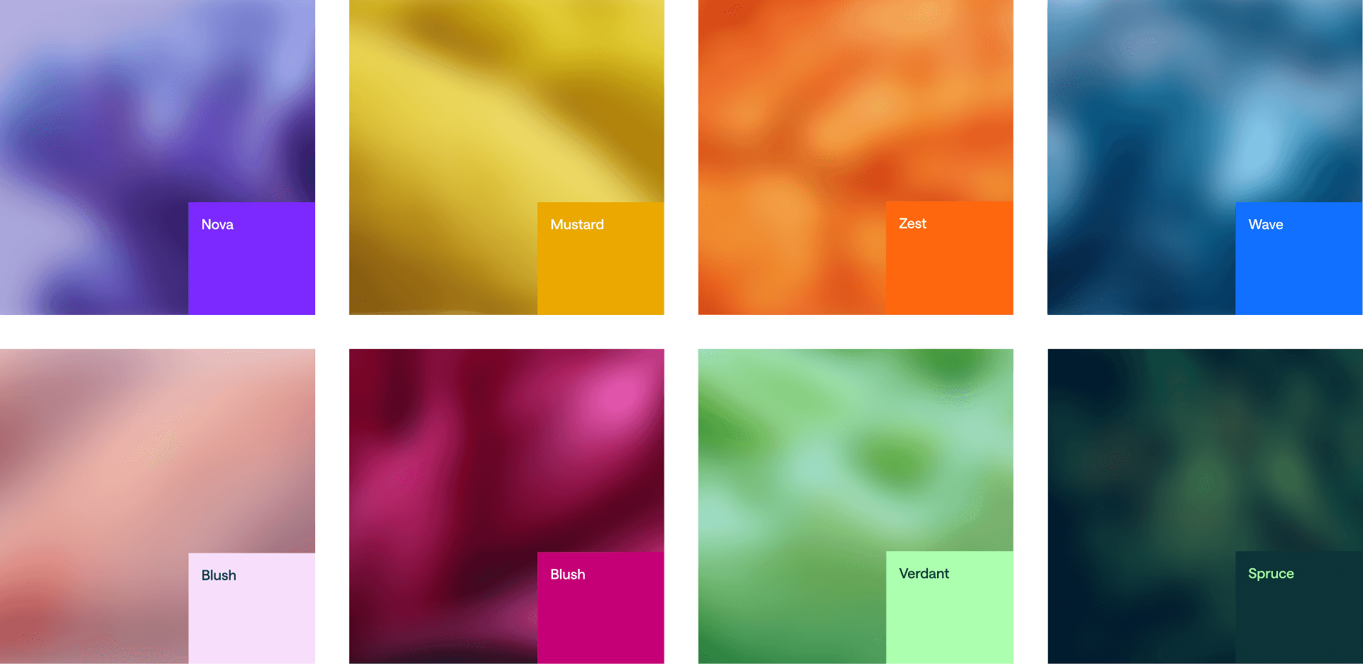
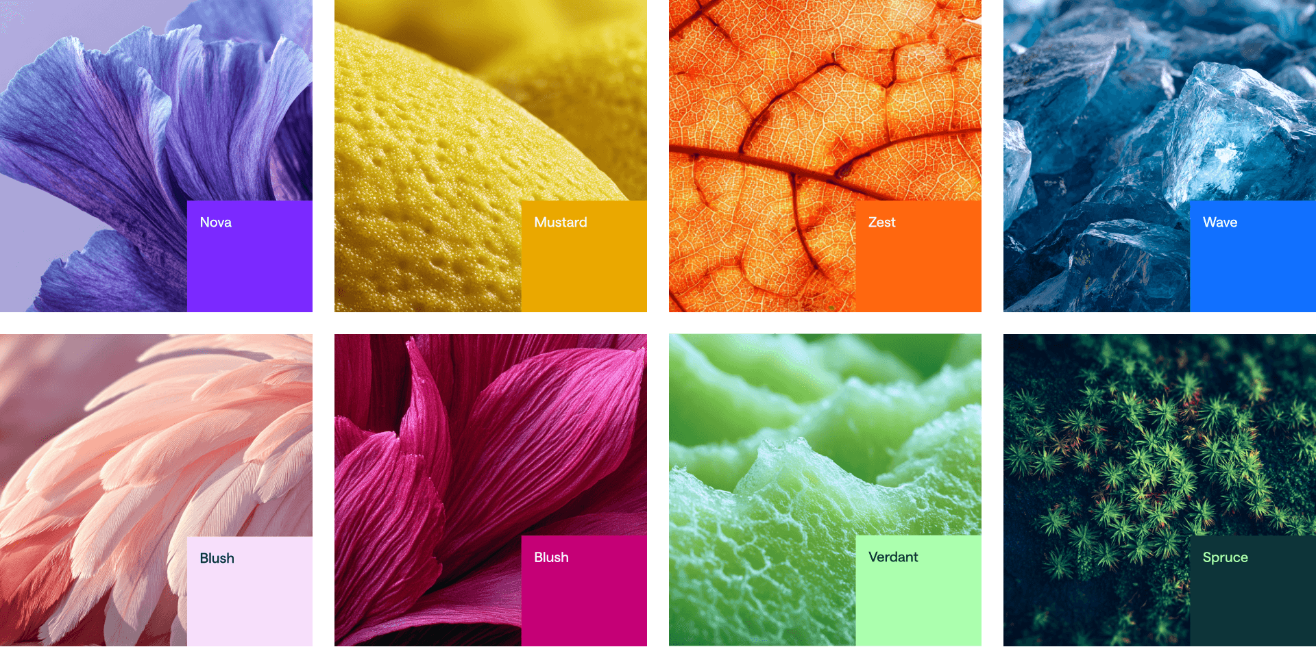
Textures
Created by blending AI-generated, close-up nature imagery color-graded to our palette with blue effects. They introduce organic depth and warmth into our geometric world.
Revealed
Usage
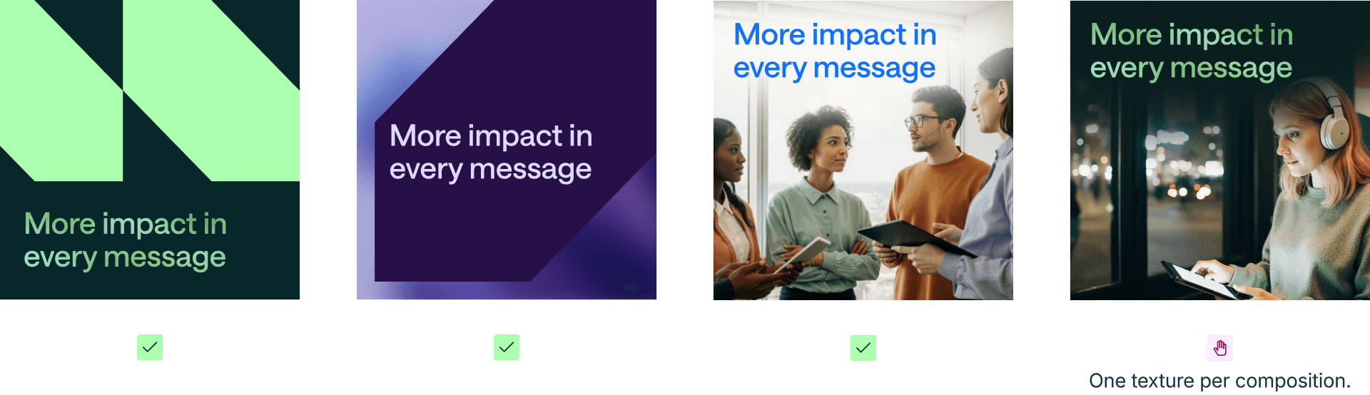
Photography
Editorial, human, and inspired by our color palette. Our photography celebrates real people and real moments—capturing the curiosity, creativity, and connection that define both our customers and our culture. Each image balances structure with spontaneity, blending soft natural light, rich color, and thoughtful composition to reflect a brand that feels intelligent, approachable, and alive.