Logo
The Customer.io logo is one of the most visible parts of our brand. It is a memorable token, acting as a recognizable signature that unites all of our visual communication.
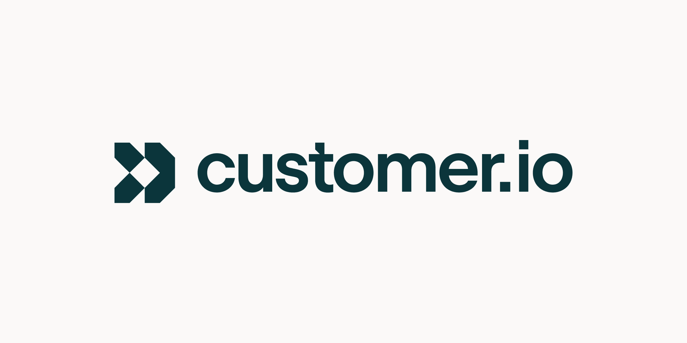
Primary lockup
Our primary lockup should be used in most cases. It consists of our mark with our logotype to the right.
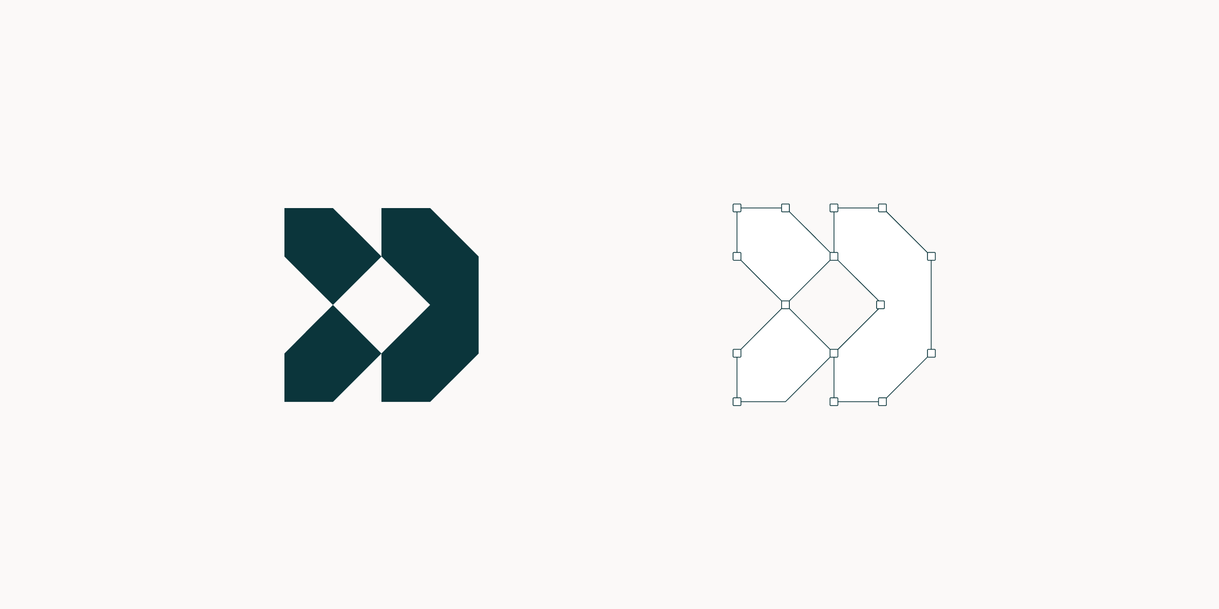
Logomark
Building on the attributes of the Customer.io brand, our mark is distinct and identifiable. Please use it consistently and follow these guidelines to build strong brand recognition.
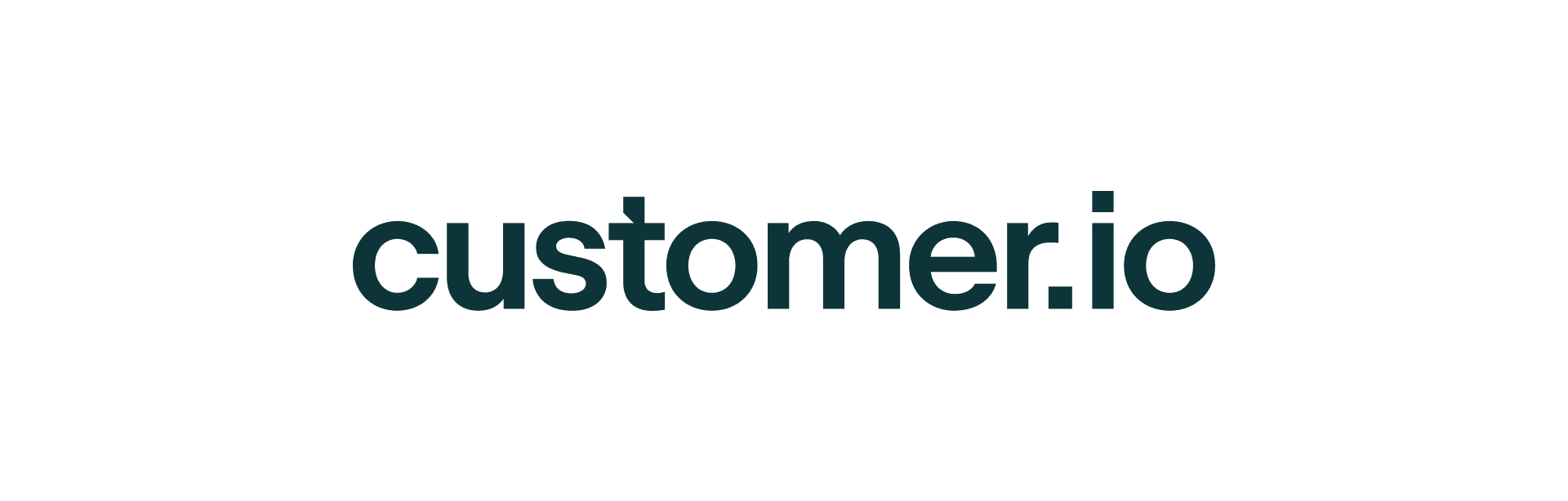
Logotype
Our logotype is custom made combining several typefaces to achieve the right balance and rigidity. It allows us to separate the mark and logotype and use them to create unique compositions and brand experiences.
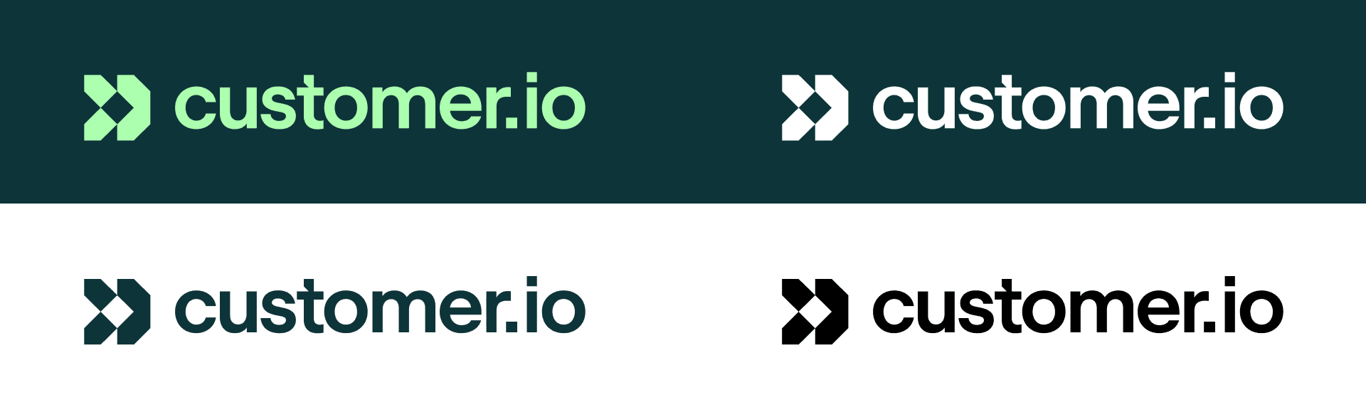
Background colors
These are the primary colorways for using the Customer.io logo on brand background colors.
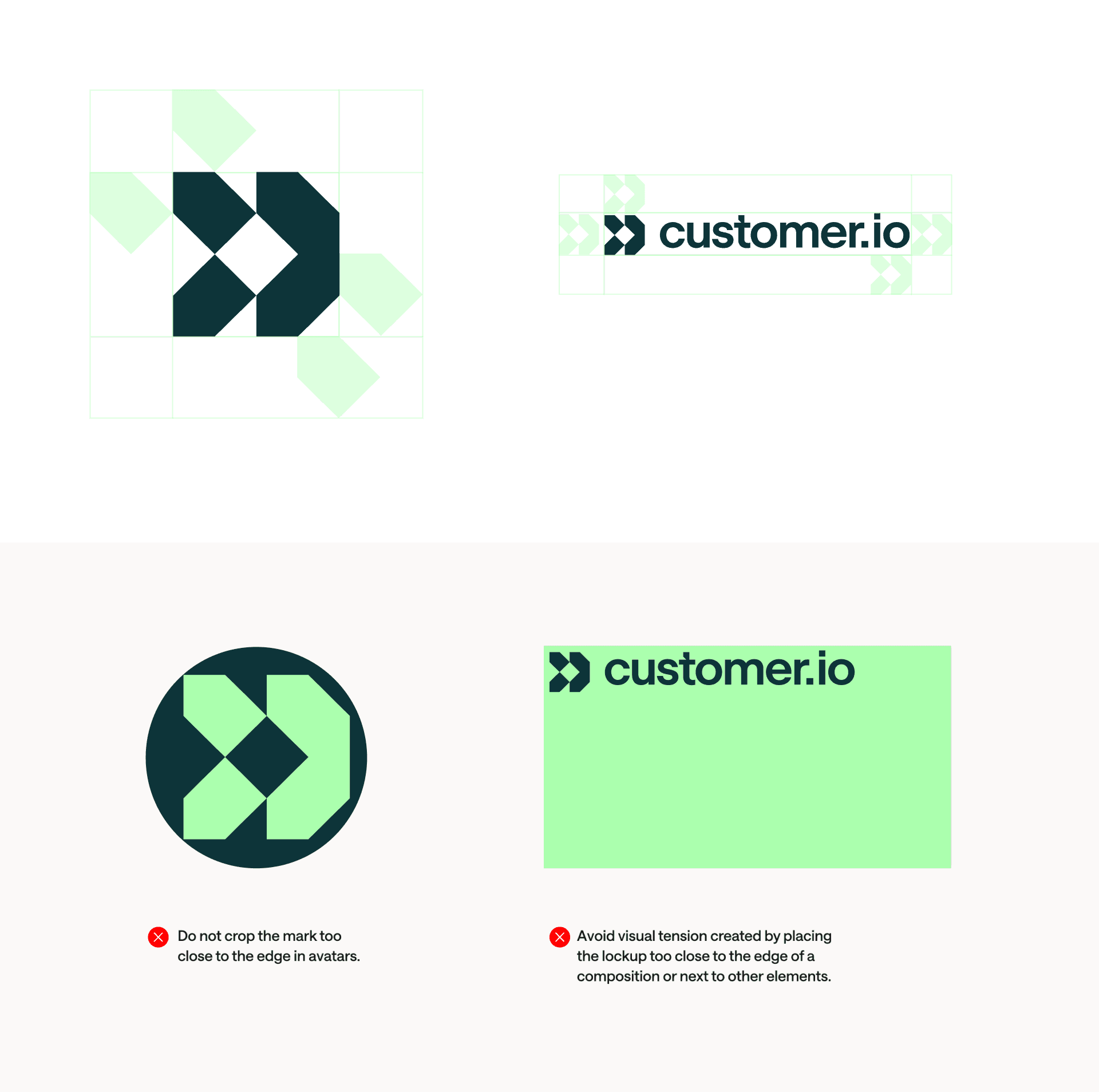
Avatars
Customer.io uses our primary brand colors, Evergreen and Verdant, for avatars across all social media accounts.

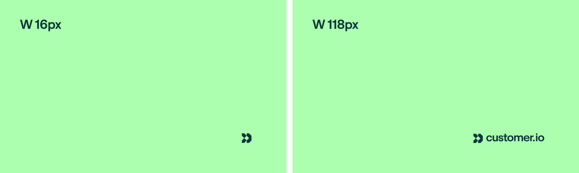
Minimum sizes
Establishing a minimum size ensures the impact and legibility of the logo remains uncompromised. For most instances, do not scale the logo below these recommended sizes.
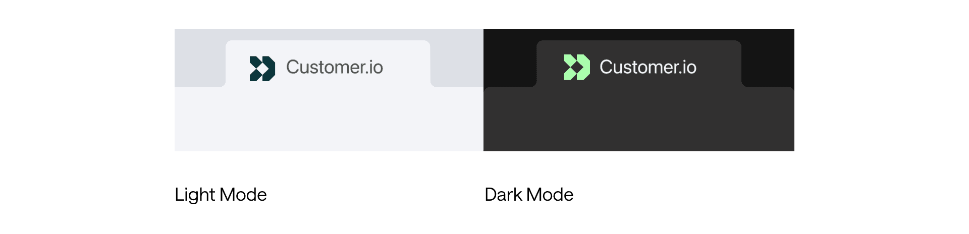
Favicon
We leverage our mark for our website's favicon.
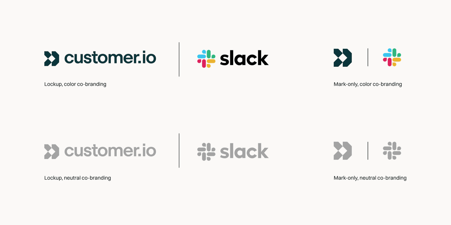
Co-branding
Intentional co-branding is important to ensure consistency of the Customer.io brand. Customer.io uses the lockup for most co-branding use cases. In some cases, we use our mark for mark-only co-branding instances. Unless otherwise noted by partner brands, each logo is optically equal, as a collection of shapes.
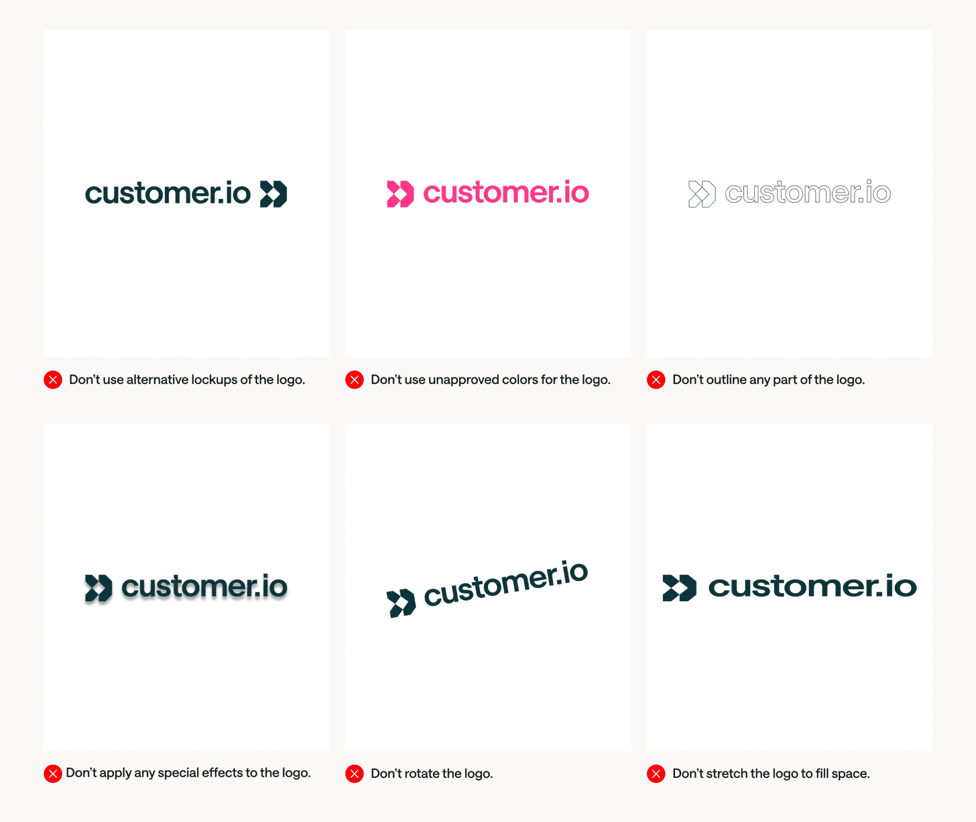
Misuse
A strong brand identity succeeds when it's used consistently. To make sure the Customer.io brand appears as consistently as possible, don't misuse our logo in these ways.
Clear space usage
The importance of clear space around brand elements cannot be overstated. Each application is unique; use your best judgment when applying the logo, and its system, to physical and digital brand materials.
Although we cannot prescribe every scenario, consider the context of the design and allow appropriate breathing room for the logo. When in doubt, refer to the samples in our brand style guide — they are brand-approved.
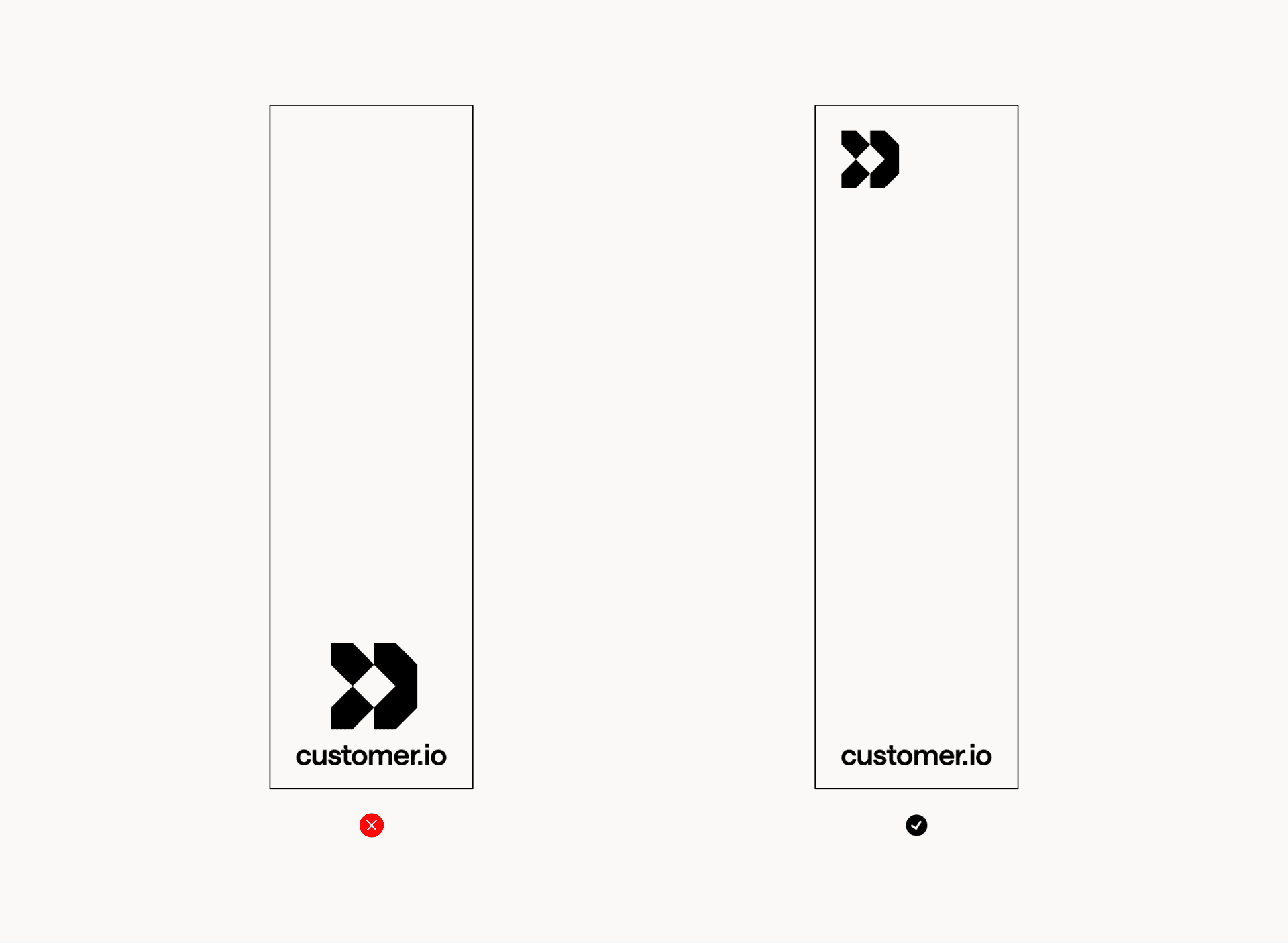
Vertical space
We recommend separating the mark and logotype when stacking the logo in a vertical composition.