Typography
Typography plays an essential role in our visual identity, lending form and flavor to our words. Use typography consistently and with intention to preserve proper hierarchy and reinforce our recognizability and distinction.
Primary typeface
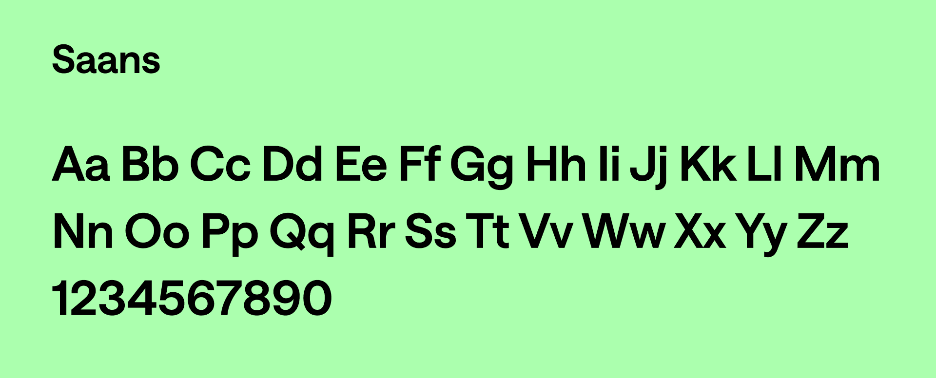
Meet our primary font — a clear voice that defines our brand. Carefully chosen for its personality and readability, it unifies our visual communication.
Type styles
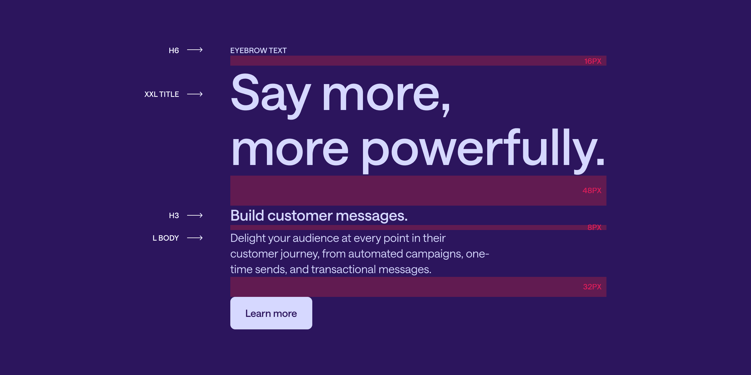
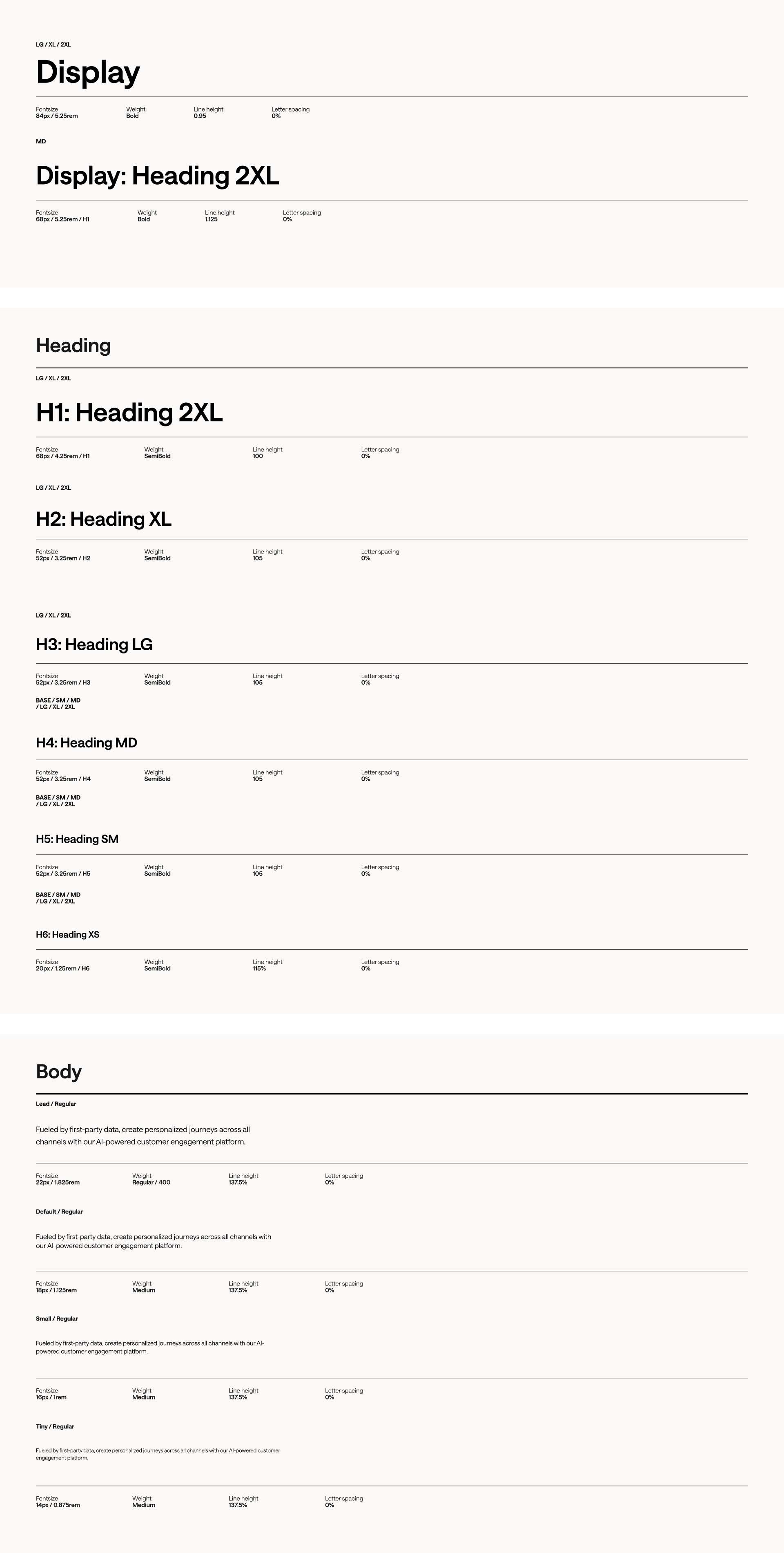
The following are the directional values for Customer.io's type hierarchy when used on the web. Note that these values may change depending on the format and medium for print and other digital platforms. They are not meant to be prescriptive, but rather serve as an example of an optimal hierarchy.
Alternatives
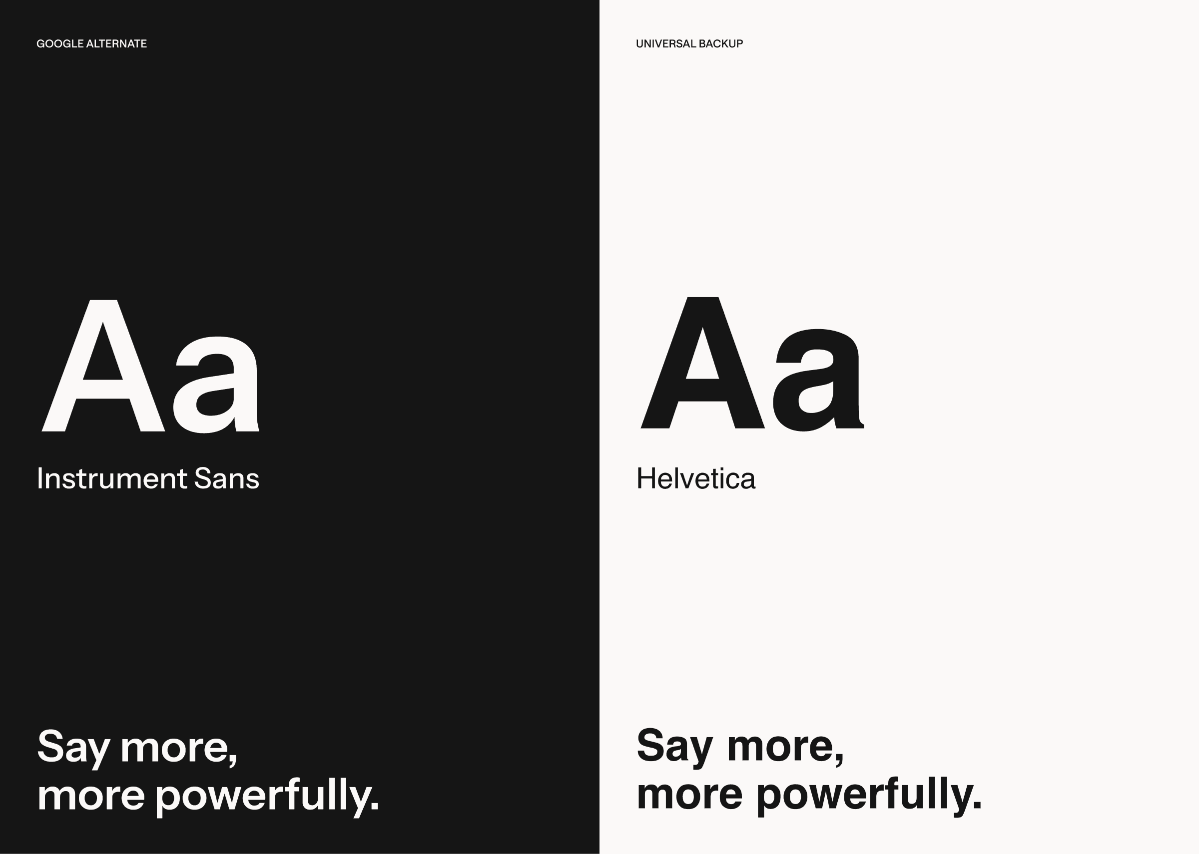
When determining which typeface to use based on your access to the brand typeface, consider this structure outlined below. If you do not have access to primary brand typefaces Saans, default to Instrument Sans from Google Fonts. If neither option is available, or you are wanting a safe universal backup, use Helvetica.
Usage
This is a quick guide for using our typography system and spacing method. While this example is not prescriptive, please use a spacing system and typography system for typographic hierarchy.