Color
Color distinguishes the Customer.io brand, adding meaning, energy, and depth to our identity. Use color appropriately through all expressions of our brand to enforce a consistent and recognizable brand experience.
Primary
These colors comprise the official Customer.io palette. They should be the foundation for any visual communication and will cover most of your color needs.
Spruce
700
0B363B
Spruce
900
031F23
Verdant
300
ABFFAE
White
Default
FFFFFF
Charcoal
25
FAFAF9
Secondary
Our secondary color palette should be used to complement our primary palette and create hierarchy throughout the brand experience.
Blush
200
FFB7DB
Zest
200
FFC6AD
Wave
200
8AC8FA
Mustard
200
F9DEA6
Nova
200
D2C8FF
Zest
500
F4691B
Wave
500
016AF2
Mustard
500
E4AA09
Nova
500
7129FF
Blush
600
9C005D
Zest
700
8B3911
Wave
700
0B3890
Mustard
700
856004
Nova
700
4600B2
Blush
800
580033
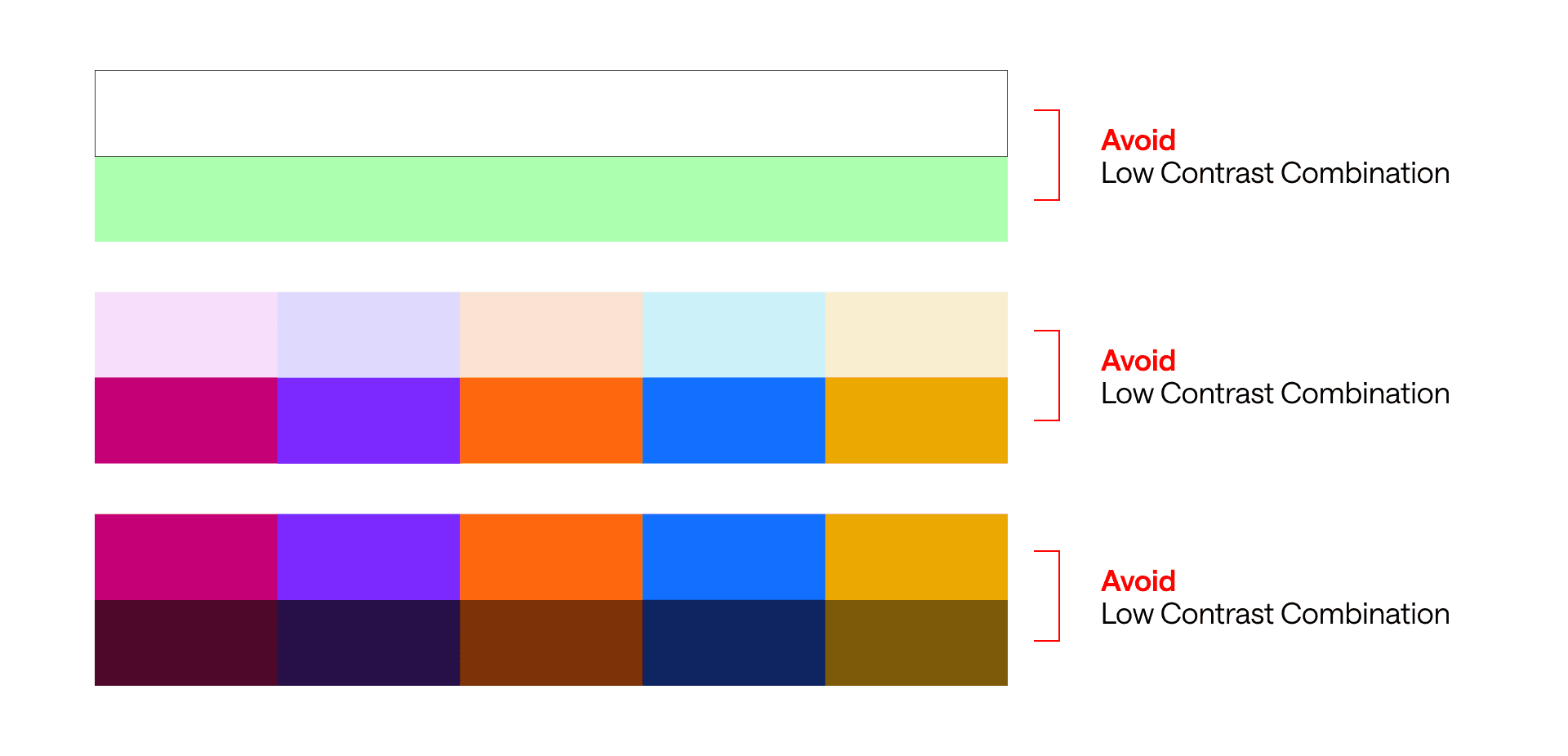
Accessibility
When used correctly, these approved color combinations meet WCAG’s AA requirements for normal text, large text, and UI components.
Themes
Themes employ a blend of light and dark shades, which, when used together, form a unique theme. This table illustrates how our colors adapt and interact with each other.
Color Grabber
The color array below allows easy access to our color library. Hover over each swatch to copy the HEX values.
Spruce
Primary color
Spruce
25
EFF9FA
Spruce
50
E5F4F5
Spruce
100
CDE3E5
Spruce
200
A1C2C6
Spruce
300
7EA7AC
Spruce
400
5F8C92
Spruce
500
437278
Spruce
600
29555B
Spruce
700
0B363B
Spruce
800
032A2E
Spruce
900
031F23
Verdant
Primary color
Verdant
25
EAFDE8
Verdant
50
D9FBD7
Verdant
100
C5FDC3
Verdant
200
BDFFBD
Verdant
300
ABFFAE
Verdant
400
8CF293
Verdant
500
5BCA68
Verdant
600
32A449
Verdant
700
077D2E
Verdant
800
01540E
Verdant
900
003500
Charcoal
Primary color
Charcoal
25
F9F9F9
Charcoal
50
F5F5F5
Charcoal
100
EBEBEB
Charcoal
200
D9D9D9
Charcoal
300
C1C1C1
Charcoal
400
A4A4A4
Charcoal
500
808080
Charcoal
600
5B5B5B
Charcoal
700
313131
Charcoal
800
141414
Charcoal
900
060606
Zest
Secondary color
Zest
25
FFF8F4
Zest
50
FEEFE8
Zest
100
FFE4D6
Zest
200
FFC6AD
Zest
300
FDAA83
Zest
400
F98B57
Zest
500
F4691B
Zest
600
BD5117
Zest
700
8B3911
Zest
800
5B230A
Zest
900
2F0F04
Wave
Secondary color
Wave
25
F6FCFF
Wave
50
E0F4FF
Wave
100
BEE4FE
Wave
200
8AC8FA
Wave
300
5BABF6
Wave
400
2A8BF4
Wave
500
016AF2
Wave
600
0150C0
Wave
700
0B3890
Wave
800
092162
Wave
900
040E38
Mustard
Secondary color
Mustard
25
FFFCF4
Mustard
50
FEF5E1
Mustard
100
FBEAC5
Mustard
200
F9DEA6
Mustard
300
F7D286
Mustard
400
F5C561
Mustard
500
E3AA0C
Mustard
600
BB8906
Mustard
700
856004
Mustard
800
543A03
Mustard
900
271800
Nova
Secondary color
Nova
25
FFFCF4
Nova
50
F0ECFF
Nova
100
E5DFFF
Nova
200
D2C8FF
Nova
300
BBA8FF
Nova
400
9D7AFF
Nova
500
7129FF
Nova
600
5B04DB
Nova
700
4600B2
Nova
800
2F0082
Nova
900
190F41
Blush
Secondary color
Blush
25
FFEFF7
Blush
50
FFE6F2
Blush
100
FFD4EA
Blush
200
FFB7DB
Blush
300
FF92C7
Blush
400
F265A8
Blush
500
BC0974
Blush
600
9C005D
Blush
700
7C0049
Blush
800
580033
Blush
900
2F081E
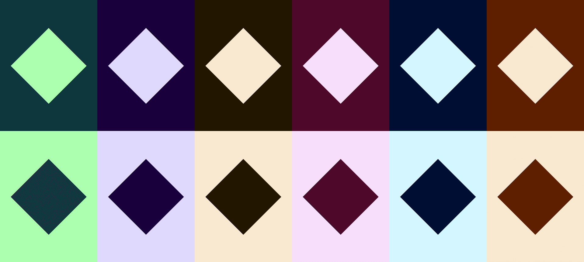
Logo & color
This table demonstrates how our logo interacts with our themes.

Text & color
This table demonstrates how text color interacts with our themes.